Victoria 3 2022-2024 Works
This is a sample of the work I have done on the game Victoria 3 and the expansions between 2022 to 2024 by Paradox Interactive. As a 2D Art Lead, I have worked closely with the Art Director to define and establish the core art pillars and the overall UI style. I have also worked on the layouts of numerous UI screens and panels, UI skins and a multitude of different icons.
For the first major dlc Spheres of Influence, the types of work include new UI layouts, new icons and icon groups and Power Bloc Emblem customisation. You can also read about the art and the thought processes for Spheres of Influence here. https://forum.paradoxplaza.com/forum/developer-diary/victoria-3-dev-diary-116-the-art-of-sphere-of-influence.1675108/
For the India focused dlc Pivot Of Empire, we drew plenty of inspiration from the Indian culture with their rich and extremely long history. Instead of focusing only on one time period exclusively, we take elements from Indian art, architecture and ornaments throughout their entire history (up until 1936 of course). You can also read about the rest of the 2D Art and the thought processes for Pivot of Empire here. https://forum.paradoxplaza.com/forum/developer-diary/victoria-3-dev-diary-135-the-2d-art-of-pivot-of-empire.1712688/

I worked closely with the Art Director to identify, define and establish the core Art pillars that would be the foundations of our artwork to come.

I laid out the guidelines for making UI Assets like frames and headers.

Guidelines for the many different icon familes and styles for the game. Flavour and readability are probably the two most important things in our icon design.
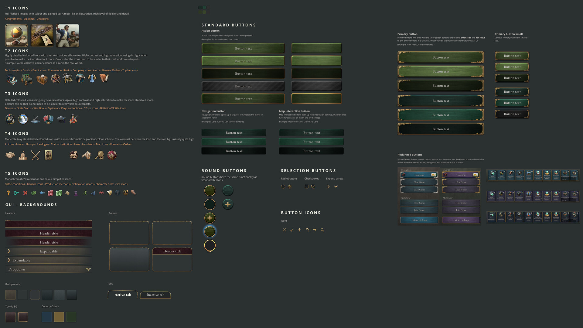
Victoria 3 is a highly complex games with many icons and different icon families. More examples of the UI frames, color palettes and button styles.

Guidelines for the many different illustrations in the game that we use to bring life and flavor to this time period.

Various UI Layouts and Panels showcasing different parts of the game (From left to right: Military Formation, Trade Goods, Formation Customization, Game Outliner, Character Panel, Tech Tree

Did the Military unit illustrations for the Asian culture set.

Set the art direction for Military Unit illustrations. The key was to show culture variation (5 base sets) while still having the same unit type be recognizable. Artworks (except the Asian set) made by the amazing 2D Art team on Victoria 3.

These are just some of the different icons I have worked on for the entire project so far (Base game and different DLCs)

UI Reskin for DLC -Voice of the People. The inspiration for the reskin was Art Nouveau. We wanted something elegant and grand but different enough from the UI of the basegame.

Ui Reskin for Dawn of Wonder DLC. The theme is Day and Night. This reskin draws inspiration from Billibin's fantasy art and uses cloth as a material, like a tapestry.

Some of the UI layout work for features like Power Blocs, Power Bloc customization and 'The Great Game' journal entry.

Assets for the customization of the Power Bloc Emblems.

We draw inspiration from Indian paintings and many floral indian motifs for the map reskin. Several key elements of Indian paintings are a flat look with limited perspective and a soft, almost watercolor like painting.

Here is the new papermap skin in its entirety!

I would like to highlight that the Social Stratification icons center around segregation of society and I think a pyramid motif works really well. Also, other icons done for various new features in the DLC.

Acceptance is a new feature in Pivot of Empire. Exploring different styles and icons to represent the 5 tiers of acceptance. We like continuity and consistent story telling between the 5 tier icons and decided to go with it.